FEATURED PROJECT · FUEL DISTRIBUTION
Built for the business of moving energy.
A corporate digital platform that makes commercial fuel supply, operational capability and the route to enquiry easy to understand.
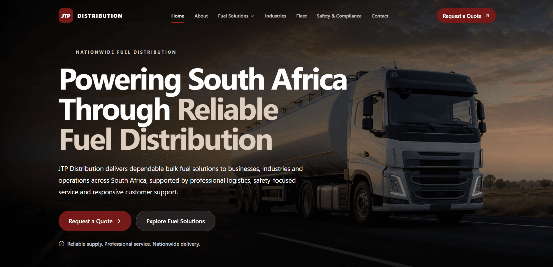
JTP Distribution operates in a sector where clarity, capability and reliable contact matter more than decorative complexity.
The website positions the business with a disciplined visual hierarchy, clean typography and an information architecture built around fuel solutions, industries, fleet capability and direct enquiry. Responsive layouts carry the same confidence from a large desktop to a mobile screen.
Project summary
Commercial information, shaped into a coherent system.
The work connects corporate positioning with the practical questions procurement teams and commercial customers need answered.
Clarify the fuel supply offer without overwhelming the visitor.
Build trust through consistent content, typography and visual structure.
Create scalable routes for products, industries and operational capability.
Make quote requests and direct contact visible throughout the journey.
CLIENT BACKGROUND · BRAND IDENTITY
Corporate confidence without corporate noise.
The about experience establishes JTP Distribution as an operational partner. Strong headings, measured supporting copy and restrained brand elements give the business a clear professional position while leaving space for evidence and capability.
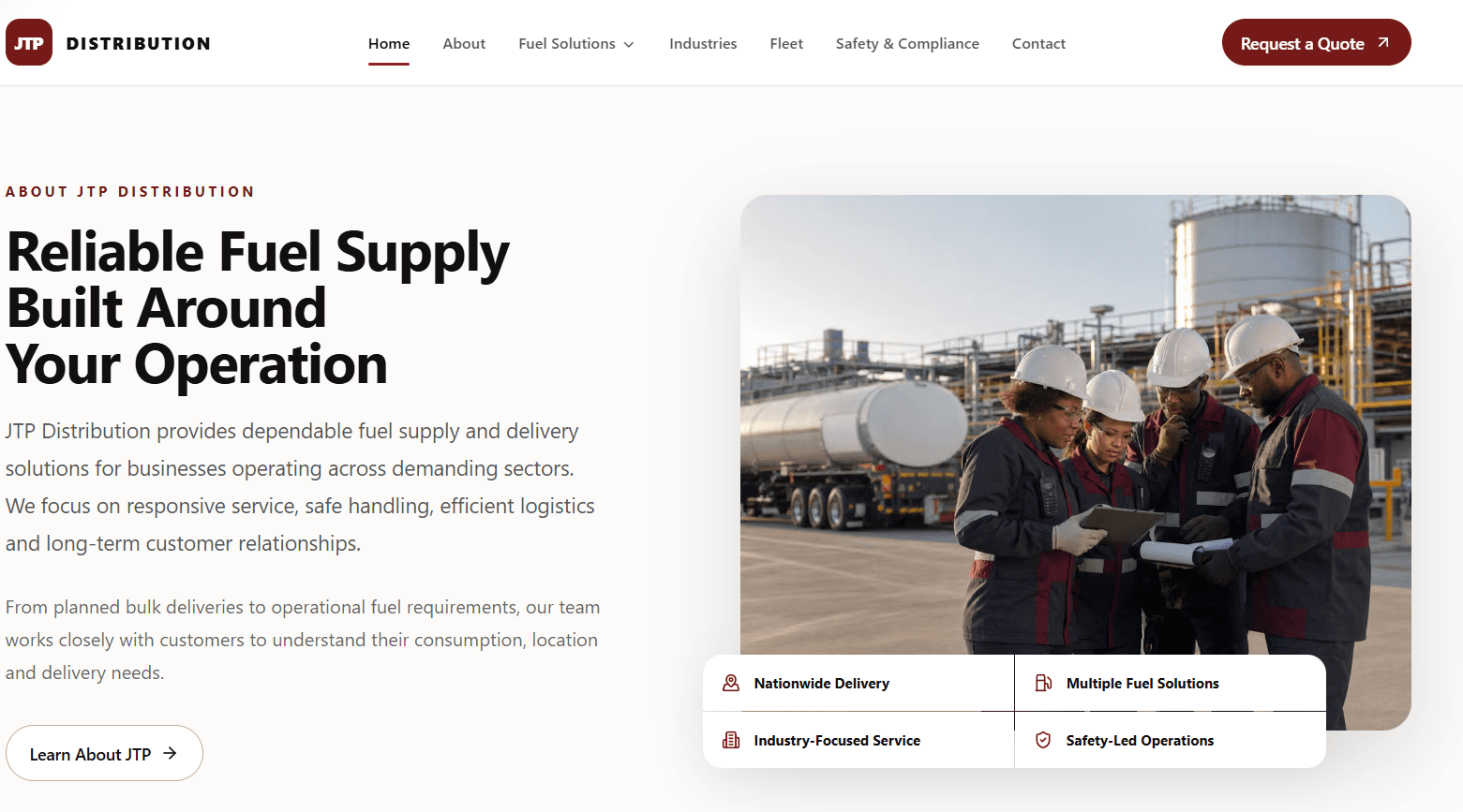
Research · strategy · design direction
The architecture follows how commercial customers evaluate supply.
The strategy groups content around three practical decisions: what can be supplied, whether the operation can support the requirement, and how to start a conversation.
Discover
Fuel categories and service pathways are visible early.
Evaluate
Product, industry and fleet pages provide focused supporting context.
Trust
Consistent structure makes a broad service offer feel controlled and credible.
Enquire
Purposeful calls to action shorten the route to a quote or conversation.
HOMEPAGE EXPERIENCE · FUEL SOLUTIONS
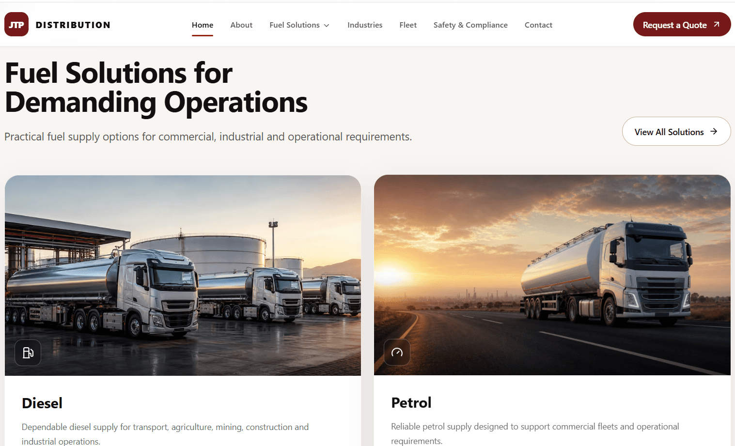
A service system designed for scanning.
Fuel solutions use a repeatable card system to organise the homepage and help customers move between services. Clear labels, controlled content depth and conversion-focused actions make the offer easier to browse, while responsive behaviour preserves the hierarchy on smaller screens.
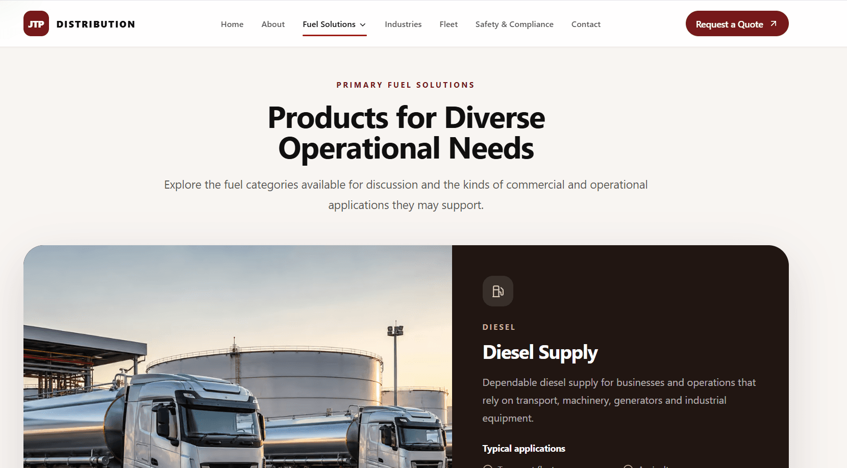
PRODUCT DETAIL
One component language, from overview to product.
Individual product pages apply the same grid, type scale and action patterns as the wider site. That consistency helps visitors understand diesel supply information, identify the next relevant detail and move into an enquiry without relearning the interface.
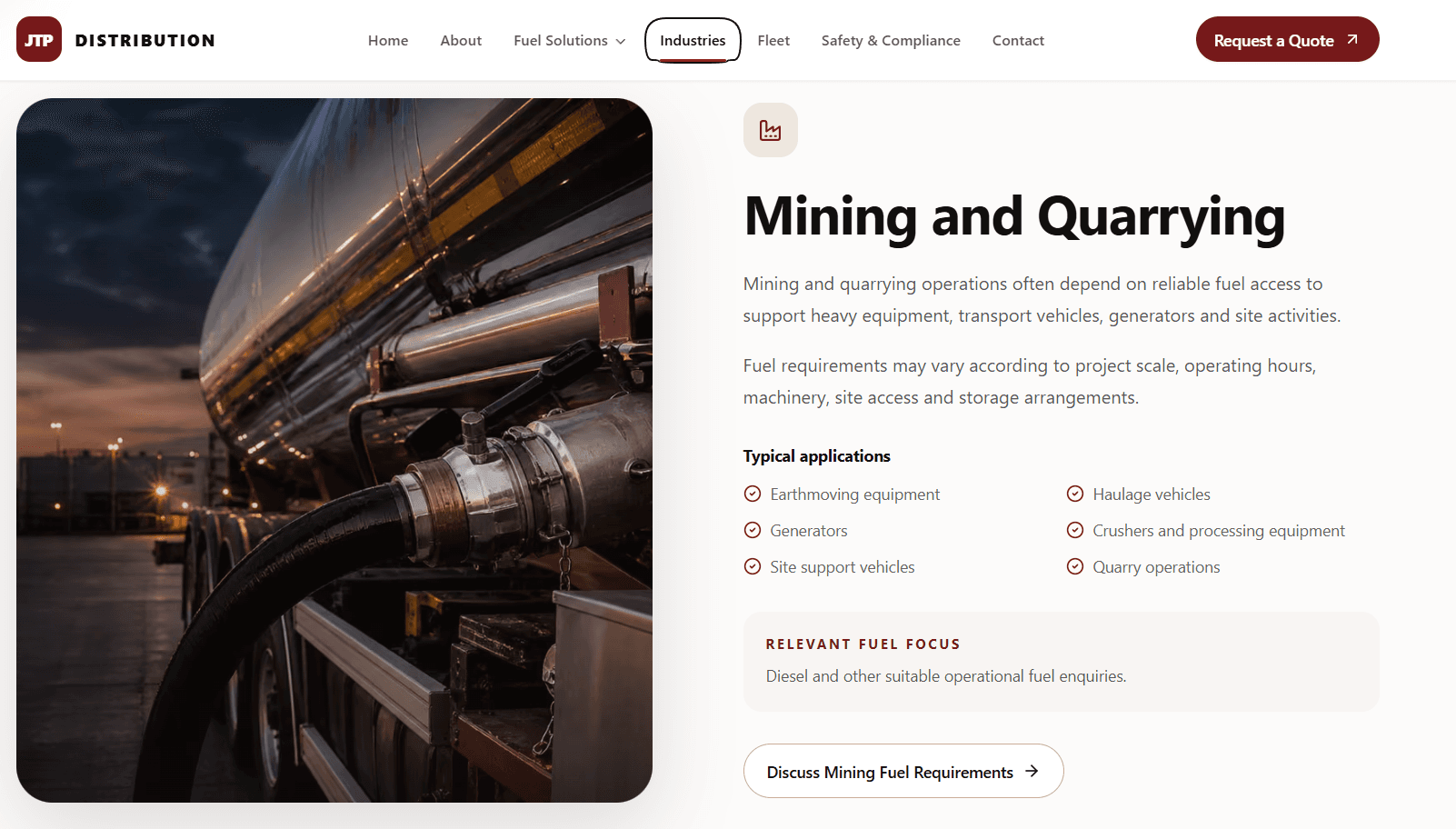
INDUSTRY PAGES
Sector relevance within a scalable architecture.
Industry-specific landing pages let the business address different operating contexts without fragmenting the website. A repeatable navigation and content structure supports sector targeting today and makes future categories easier to add.
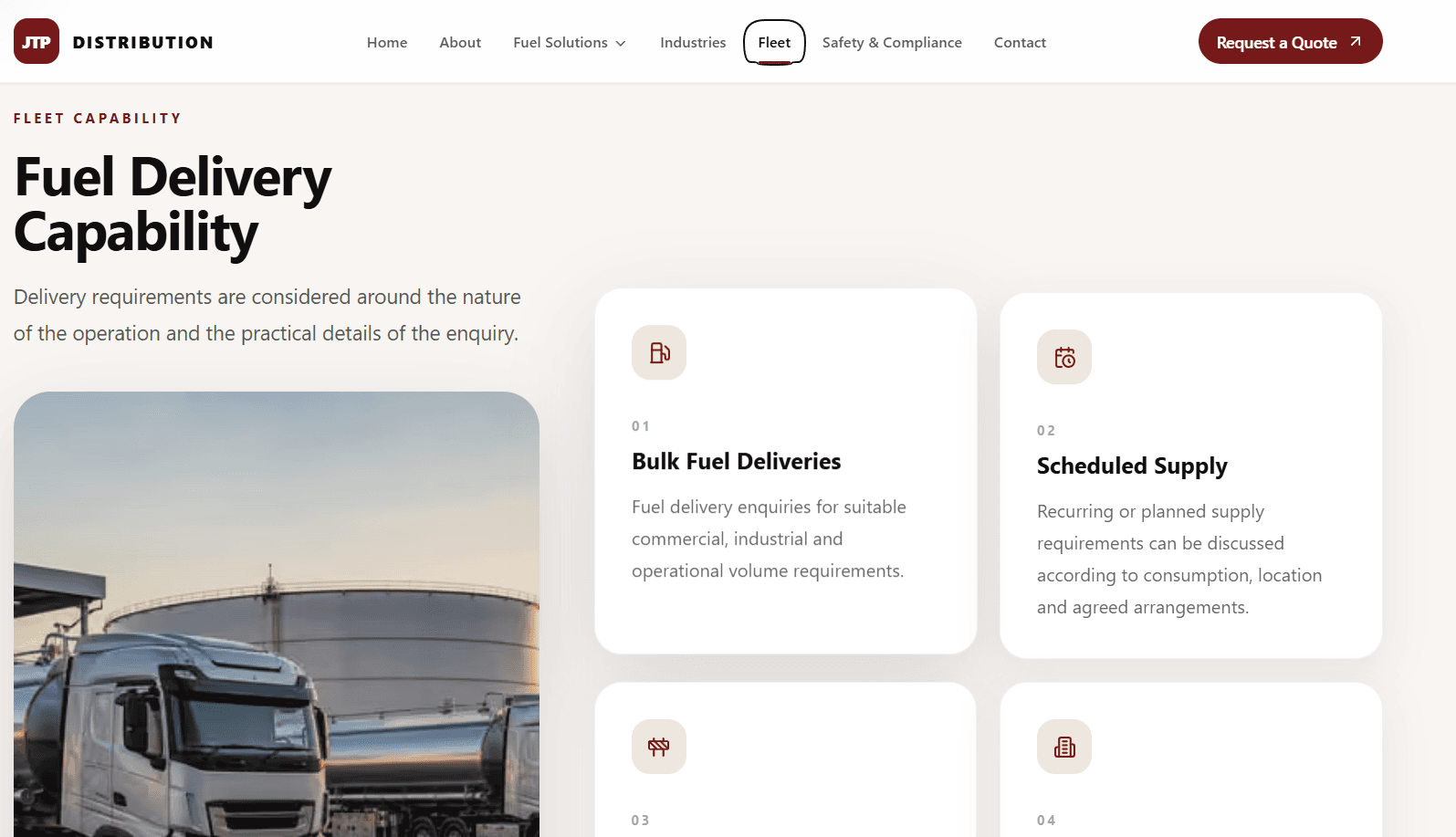
FLEET CAPABILITIES
Operational capacity given its own stage.
The fleet page supports the corporate proposition with focused capability content. Responsive cards, structured proof points and a measured hierarchy turn operational detail into a page that is easy to assess rather than a dense catalogue.
Lead generation experience
Two clear ways to begin the conversation.
The enquiry and contact experiences work as complementary conversion paths: one captures a considered quote request, while the other makes direct support and contact options immediately visible.
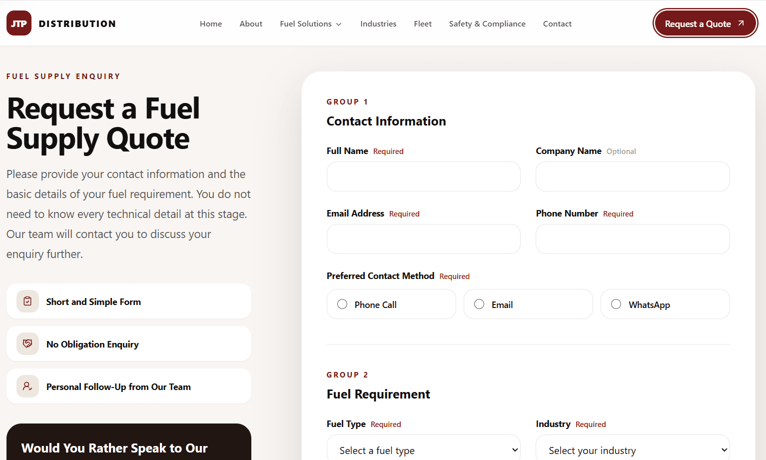
Quote request experience
The form breaks a commercial request into understandable inputs, with visible labels, keyboard access and an intentionally simple flow.
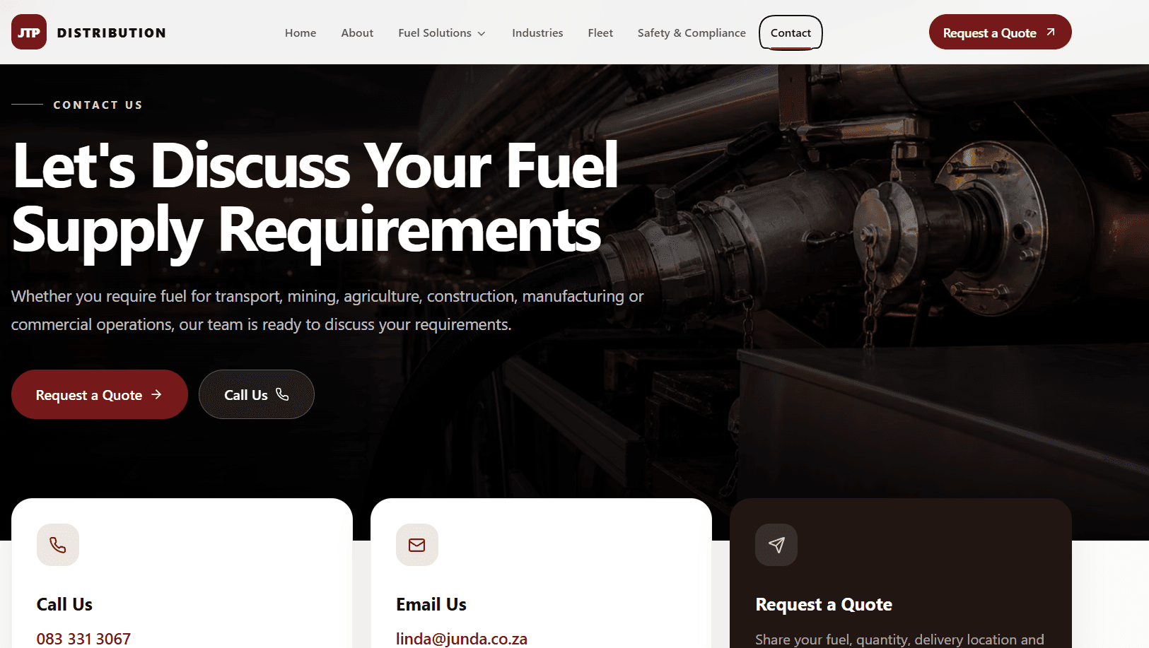
Contact experience
Contact options, trust cues and direct calls to action are arranged in a clear hierarchy for customers who prefer immediate assistance.
RESPONSIVE EXPERIENCE
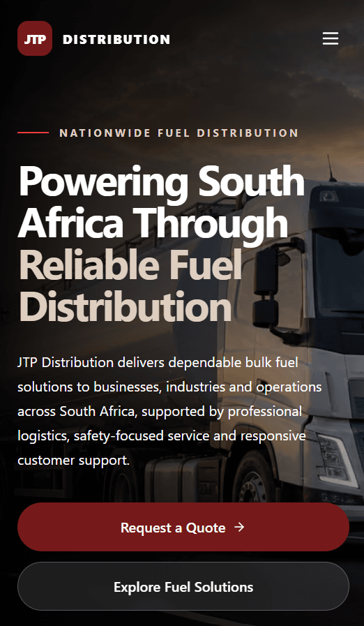
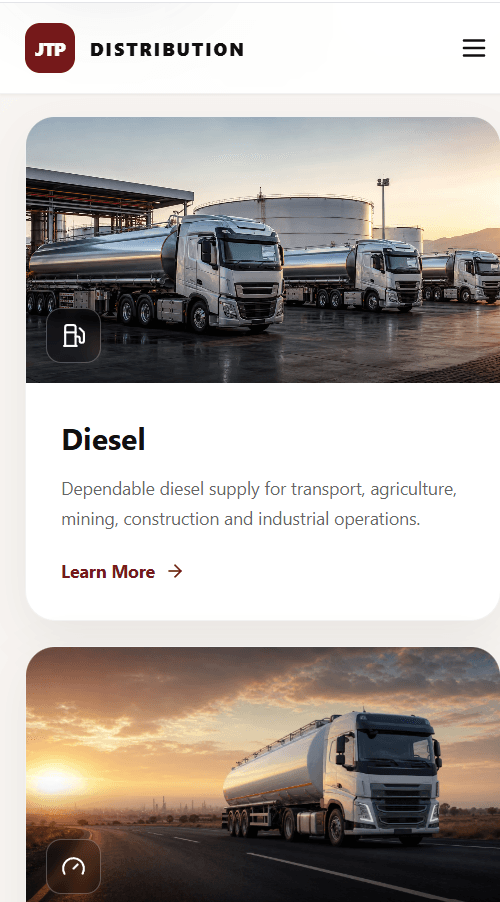
The hierarchy adapts. The brand stays intact.
Mobile-first thinking informs responsive grids, navigation, touch targets and adaptive typography. Reserved media space protects against layout shifts, while focused content and optimised images support performance on constrained connections.
Performance · accessibility · SEO
A quality foundation behind the presentation.
Performance
- Responsive image sizes and lazy loading
- Hero image prioritised; supporting media deferred
- Reserved aspect ratios to avoid layout shift
- Transform and opacity-led motion
Accessibility
- Semantic page structure and heading order
- Meaningful alternative text
- Keyboard-friendly links and visible focus states
- Readable contrast and generous touch targets
SEO
- Canonical and robots metadata
- Open Graph and Twitter previews
- Breadcrumb and CreativeWork structured data
- Search-oriented headings and internal links
Technology & system
Built around reusable, performance-aware patterns.
Outcome
A more coherent digital expression of the operation.
A clearer route from service discovery to enquiry
A consistent system across fuel, industry and capability content
A professional corporate presence across desktop and mobile
A scalable foundation for future service and sector pages
YOUR NEXT PROJECT